Tag: flyer design

  • Leaflet Design Best Practices: A 2026 Guide to London Campaign Success

    Leaflet Design Best Practices: A 2026 Guide to London Campaign Success

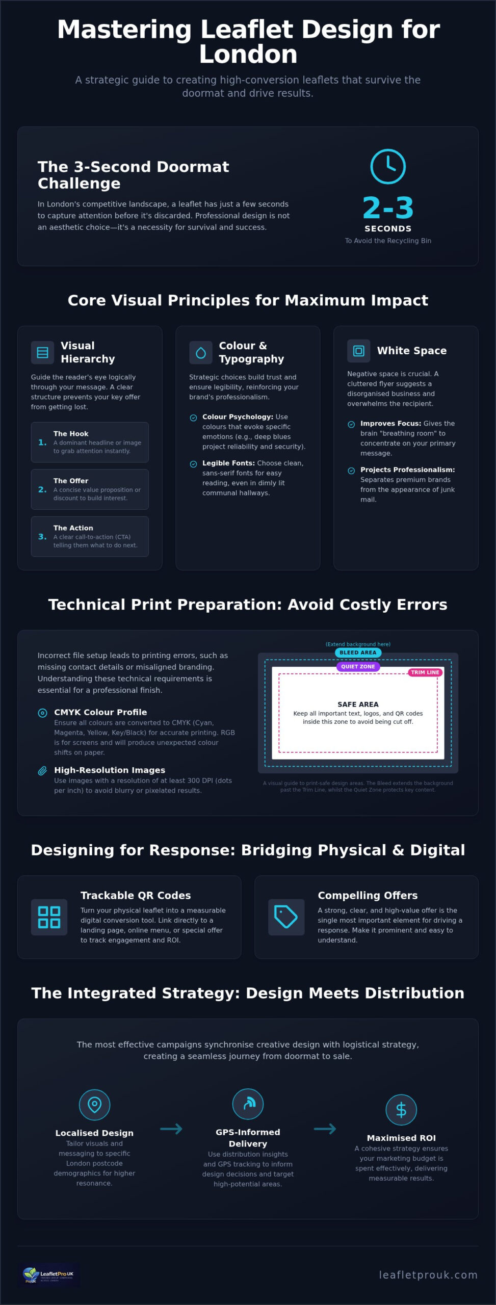
    A leaflet that lands on a London doormat has exactly two seconds to justify its existence before it meets the recycling bin. You’ve likely felt the frustration of investing in a campaign only to see your hard-earned budget produce silence instead of sales. In a city as fast-paced as ours, generic flyers often fail because they lack the visual authority needed to capture attention. Understanding leaflet design best practices is no longer just about aesthetics; it’s about survival in a competitive physical marketplace where every millimetre of paper must work for your brand.

    This guide provides the technical clarity and creative strategies required to turn your marketing materials into high-conversion sales channels. We’ll demystify complex print terms like bleed and CMYK whilst showing you how to maintain brand consistency across every London postcode. You’ll learn how to bridge the gap between professional design and seamless distribution, ensuring your next campaign delivers the measurable response rates your business deserves. From doormat-ready layouts to GPS-tracked delivery standards, we’re outlining the roadmap for your 2026 campaign success.

    Key Takeaways

    • Learn how the three-second rule dictates campaign success by capturing attention on competitive London doormats before the recipient reaches the recycling bin.
    • Master leaflet design best practices including visual hierarchy and colour psychology to guide potential customers from the initial hook to the final action.
    • Avoid expensive production errors by understanding the technical requirements of print, from CMYK colour profiles to essential bleed and quiet zones.
    • Discover how to integrate QR codes and high-value offers that turn a physical flyer into a trackable digital conversion tool.
    • Understand the benefits of an integrated workflow where design decisions are informed by local London postcode data and GPS-tracked delivery insights.

    Why Professional Leaflet Design Support is Essential for London Campaigns

    London letterboxes are battlegrounds for attention. Every day, households in boroughs like Kensington or Fulham receive a high volume of marketing material. Your headline must win the battle of the doormat instantly; you have roughly three seconds before a recipient decides whether to read on or recycle. This narrow window is why generic flyers fail. Adhering to leaflet design best practices ensures your message survives this initial sorting process by presenting a clear, authoritative value proposition that resonates with a busy urban audience.

    Professional design builds immediate trust through the psychology of tangibility. The history and uses of flyers show that physical marketing’s strength lies in its ability to create a lasting impression in a way digital ads cannot. A well-constructed leaflet feels substantial and credible. If a flyer looks cheap, cluttered, or poorly aligned, the recipient subconsciously transfers that lack of quality to your business. High standards in your creative assets signal that you’re an established and dependable brand.

    Design shouldn’t exist in a vacuum. It must be informed by the eventual GPS-tracked distribution area to be truly effective. At LeafletPro UK, we believe leaflet design support should be a collaborative process that considers the specific streets your flyers will land on. When your design is synchronised with your logistical strategy, you create a seamless journey from the doormat to the sale.

    The Risk of DIY Templates

    Generic online templates often ignore the nuances of the London market. These “off-the-shelf” designs frequently fail to resonate with local audiences because they lack a specific aesthetic hook tailored to the city’s diverse boroughs. Beyond the visuals, DIY tools often overlook critical technical requirements like print bleed and quiet zones. If your design is cut incorrectly during the printing process, your contact details or call to action might be lost. Using a template might seem cost-effective initially, but the hidden cost of a failed campaign far outweighs the savings. A flyer that doesn’t fit the letterbox or looks disjointed from your website damages your professional standing and breaks brand consistency.

    London-Specific Audience Targeting

    Effective campaigns tailor their visual language to specific demographics. A flyer designed for a young professional in Shoreditch should look and feel different from one targeting a family in Richmond. Professional designers use local insights to choose imagery and typography that converts within these distinct micro-markets. Localised design is the alignment of creative assets with specific postcode demographics. By matching your creative approach to the household’s expectations, you increase the likelihood of a positive response. This targeted approach ensures your budget isn’t wasted on generic messaging that fails to connect with the people most likely to use your services.

    Core Visual Principles: Hierarchy, Colour, and White Space

    Applying leaflet design best practices ensures your message is not only seen but processed in the few seconds before a recipient reaches their kitchen table. A professional layout functions as a silent guide, directing the reader’s eye through a logical sequence of information. This starts with a dominant “Hook” to grab attention, followed by a concise “Offer” to build interest, and concludes with a clear “Action”. Without this structured hierarchy, even the most compelling discount becomes lost in a sea of competing text.

    Strategic use of colour and white space is what separates a premium brand from junk mail. Whilst it’s tempting to fill every millimetre of paper to maximise value, a cluttered flyer suggests a disorganised business. White space, or negative space, provides the visual “breathing room” required for the brain to focus on your primary message. Similarly, your colour palette should evoke specific emotional responses whilst adhering to your brand guidelines. For example, deep blues often project reliability and security, which is essential for service-based businesses operating in London’s competitive residential markets.

    Typography also plays a critical role in conversion, particularly in the unique environment of London housing. Many recipients will first view your leaflet in dimly lit communal hallways or porches. Choosing clean, sans-serif fonts ensures legibility at a glance. Avoid overly decorative scripts that sacrifice clarity for style. If you’re struggling to balance these creative elements with your marketing goals, our leaflet design support provides the expertise needed to create a layout that commands professional respect.

    Creating a “Focal Point” that Works

    Your leaflet needs a singular hero image to anchor the design. Using a collage of small, low-resolution photos creates confusion and dilutes your impact. Position your primary offer near this focal point so it’s impossible to miss. We recommend using a “Z-Pattern” layout, which follows the natural way Londoners scan physical documents: starting at the top-left, moving across to the top-right, and then sweeping down to the bottom-right for the final call to action. This methodical approach ensures the most important details are positioned exactly where the eye naturally lands.

    Branding and Credibility

    Trust is a primary driver for response rates in London’s boroughs. To build this, your logo and contact details must be prominent but integrated into the design rather than appearing as an afterthought. You can enhance credibility by including trust signals, such as professional associations or even subtle imagery of local London landmarks relevant to your target postcode. This creates an immediate sense of local presence. Maintaining a clean, organised aesthetic reflects a reliable business, giving the homeowner peace of mind that they are dealing with an established professional rather than a fly-by-night operation.

    Technical Best Practices: Preparation for High-Quality Printing

    Adhering to leaflet design best practices requires a transition from creative vision to technical precision. Even the most striking layout will fail if the file isn’t prepared correctly for the physical printing process. One of the most common errors involves colour profiles. Digital screens display images in RGB (Red, Green, Blue), whilst professional printers use CMYK (Cyan, Magenta, Yellow, Key/Black). If you don’t convert your design to CMYK before sending it to print, the final colours may appear dull or distorted compared to what you see on your monitor.

    Protection against cutting errors is equally vital. “Bleed” refers to the extra 3mm of background design that extends beyond the final trim line, ensuring no white edges appear if the cutting blade shifts slightly. Similarly, “quiet zones” are the margins inside the trim line where no critical text or logos should be placed. By maintaining these zones, you ensure your contact details remain intact and legible once the leaflets are finished and ready for distribution across London.

    Image quality is a non-negotiable standard. For professional London marketing, 300dpi (dots per inch) is the minimum resolution required to avoid pixelation. Low-resolution images suggest a lack of care, which can damage your brand’s credibility before the recipient has read a single word. To ensure the highest fidelity, we require print-ready PDFs as the industry standard. This format embeds all fonts and high-resolution assets, providing a stable file that translates perfectly from the designer’s desk to our high-quality printing presses.

    Choosing the Right Paper Stock (GSM)

    The weight of your paper, measured in Grams per Square Metre (GSM), significantly influences the “hand-feel” and perceived value of your brand. A 130gsm stock is the reliable choice for high-volume distributions, providing a professional look whilst remaining cost-effective. However, for premium London boroughs, upgrading to 250gsm or higher creates a sense of luxury and durability. You can explore our full range of options in our guide to Leaflet Printing Finishes London.

    Finishes that Demand Attention

    Selecting the right finish depends on your industry and brand identity. Gloss finishes offer vibrant colours and a high-shine look, whilst matte or silk options provide a more understated, sophisticated feel. Beyond aesthetics, specialised coatings play a functional role by protecting your leaflets from scuffing or moisture during the door-to-door delivery process. As we move through 2026, many London residents also expect a commitment to the environment. Choosing sustainable, FSC-certified paper and vegetable-based inks demonstrates that your business is both professional and eco-conscious.
    Leaflet Design Best Practices: A 2026 Guide to London Campaign Success

    Designing for Response: CTAs and Tracking Integration

    A visually stunning leaflet is only successful if it triggers a measurable response. In the competitive London market, leaflet design best practices must bridge the gap between creative aesthetics and distribution logistics. Many businesses treat design and distribution as separate silos, but a high-conversion campaign requires these elements to work in tandem. By integrating specific tracking mechanisms directly into your layout, you transform a physical flyer into a data-rich marketing channel that justifies every penny of your investment.

    Tracking ROI is essential for verifying the effectiveness of your campaign. You can achieve this by using unique phone numbers or dedicated landing pages for different London postcodes. Alternatively, unique discount codes allow you to attribute every sale to a specific distribution wave. These leaflet design best practices ensure your marketing remains accountable and transparent. To prevent your leaflet from sitting indefinitely on a sideboard, employ the scarcity principle. Including a clear expiry date creates a sense of urgency, prompting the recipient to act whilst your brand is still fresh in their mind. This methodical approach to data collection provides the evidence needed to refine future campaigns.

    Optimising QR Codes for Conversion

    QR codes are the most efficient way to link physical leaflets to your London-specific landing pages. However, their placement must be strategic. The code should be large enough to scan easily but shouldn’t dominate the visual hierarchy. Most importantly, you must provide a compelling reason to scan. A prompt such as “Scan for 20% off your first London order” provides immediate value and encourages engagement. For more inspiration on how to phrase these prompts, see our 45+ Leaflet Call to Action Examples.

    The Offer-Centric Layout

    The “What’s in it for me?” factor must be the most prominent text on your page. If a recipient cannot identify the benefit within two seconds, they’ll likely discard the flyer. Use bold subheadings to break up copy and highlight secondary benefits, ensuring the main offer remains the focal point. Direct Response Design is a layout focused on a single, measurable user action. This approach removes friction and guides the reader toward a specific outcome, whether that’s a phone call, a website visit, or an in-store redemption. By simplifying the decision-making process, you increase the likelihood of a conversion.

    Maximising ROI with LeafletPro UK’s Integrated Design Service

    Choosing an integrated partner ensures your campaign moves flawlessly from the initial concept to the final letterbox. Whilst many agencies treat creative work and logistics as separate entities, LeafletPro UK operates an end-to-end solution that keeps design, print, and distribution under one roof. This unified approach eliminates the risk of technical translation errors and ensures that every element of your flyer adheres to leaflet design best practices from the very first draft. By managing the entire lifecycle of your marketing material, we provide a level of accountability that fragmented services cannot match.

    Our creative decisions are uniquely informed by the logistical data we gather daily across London postcodes. We use insights from previous GPS-tracked campaigns to suggest the best creative approach for your specific target area. If a particular borough responds better to certain imagery or specific paper finishes, our designers incorporate these findings into your layout. This data-led strategy ensures your design isn’t just attractive; it’s technically optimised for the specific demographics you intend to reach, providing the peace of mind that your investment is grounded in evidence.

    Quality control remains a priority throughout the process. We ensure your leaflets are printed to the exact standards required for our distribution teams, avoiding common issues like thin paper that jams in letterboxes or finishes that smudge in transit. From the first pixel of your design to the final doormat in London, we provide the visibility and systematic reliability necessary for a successful campaign. This integrated workflow saves time and reduces the confusion often associated with managing multiple vendors.

    Working with LeafletPro UK Designers

    Our collaborative process is designed to turn your business goals into professional creative assets. We work closely with you to ensure your campaign is “distribution-ready”, meaning every file meets our rigorous technical standards for print and delivery. This proactive approach prevents the delays and errors often associated with generic DIY templates. For a deeper look at how we synchronise these elements, read our Professional Leaflet Design and Distribution London guide.

    The Final Step: GPS-Tracked Delivery

    A high-quality design deserves a delivery method that is equally sophisticated. Once your design is finalised and printed, our GPS-tracked teams take over, providing the ultimate proof that your material reached its target. These reports offer a level of transparency that gives you total confidence in your marketing spend. By closing the loop between design and delivery, we ensure your brand message lands exactly where it’s needed, supported by a diligent partner who values results over vague promises.

    Future-Proofing Your London Leaflet Campaigns

    Success in the capital’s competitive market requires more than just high-quality paper. It demands a strategic alignment of visual hierarchy, technical precision, and measurable response mechanisms. By implementing leaflet design best practices, you ensure your brand survives the initial doormat sort and drives tangible engagement through trackable calls to action. Moving beyond generic templates allows your business to project the authority and credibility that London residents expect.

    Our integrated approach provides the peace of mind that your campaign is handled with professional scrutiny from the first pixel to the final delivery. With an expert London-based design team and GPS-tracked delivery data for 100% transparency, we manage the entire lifecycle of your marketing material. This end-to-end management ensures your creative vision is never compromised by technical errors or unreliable distribution.

    Transforming your marketing into a high-conversion sales channel starts with a commitment to professional standards. We’re ready to help you turn every London letterbox into a new opportunity for growth.

    Frequently Asked Questions

    What is the best size for a business leaflet in London?

    A5 is widely considered the most effective size for London-based campaigns. This format provides enough space for a clear visual hierarchy whilst remaining compact enough to fit through standard residential letterboxes without being damaged. Whilst A4 or A6 options are available, A5 strikes the perfect balance between printing costs and impact. It’s a versatile choice that allows for bold headlines and clear calls to action, ensuring your brand message remains professional and legible.

    How much does professional leaflet design support cost?

    The cost of professional design support depends on the specific requirements of your campaign and the complexity of the creative brief. Investing in expert design is a strategic move that helps you avoid the common pitfalls of DIY templates which often fail to convert. At LeafletPro UK, we focus on creating assets that are “fit for the doormat”, ensuring your budget isn’t wasted on materials that lack the visual authority needed to capture attention.

    Can I provide my own design for printing and distribution?

    You are welcome to provide your own artwork for our printing and distribution services. To maintain our high standards of quality control, your files must meet specific technical requirements, such as including a 3mm bleed and using the CMYK colour profile. We recommend reviewing leaflet design best practices before submission to ensure your layout is optimised for our GPS-tracked delivery teams. Our experts can perform a basic check to confirm your files are distribution-ready.

    What file format should I use for my leaflet design?

    A high-resolution, print-ready PDF is the industry standard and our preferred format for all leaflet campaigns. This file type ensures that your fonts, images, and layout remain stable during the transition from design to print. It’s essential that all images within the PDF are at least 300dpi to prevent pixelation. Using a PDF format allows us to maintain the integrity of your brand’s colours and sharp details, providing a professional finish that reflects your business quality.

    How do I ensure my leaflet design is print-ready?

    Ensuring your design is print-ready involves checking several technical benchmarks. You must confirm that your document uses the CMYK colour space rather than RGB to ensure colour accuracy on paper. Additionally, include a 3mm bleed around all edges and keep critical text within a “quiet zone” away from the trim line. Verification of image resolution is also vital; every graphic should meet the 300dpi standard. These steps prevent production delays and ensure a clean, professional final product.

    What is the difference between a flyer and a leaflet in design terms?

    In design terms, the words “flyer” and “leaflet” are often used interchangeably, though subtle differences exist. A flyer is typically a single-sheet, flat document used for high-volume distribution. A leaflet may involve more complex designs, such as folds or premium paper stocks, and is often used for more detailed service descriptions. Regardless of the terminology, the core leaflet design best practices remain the same: you need a strong hook, a clear offer, and a compelling call to action.

    How many words should be on a standard A5 leaflet?

    For a standard A5 leaflet, we recommend keeping your copy concise to avoid a cluttered look. Aim for a maximum of 150 to 200 words. This allows for a dominant headline, a few punchy bullet points highlighting your primary benefits, and a clear call to action. Space is a premium commodity on a physical flyer; using too much text can overwhelm the reader and lead to your message being ignored. Clear, brief messaging always performs better.

    Can you help with the copy and headlines for my leaflet?

    Yes, our professional design support includes guidance on crafting effective headlines and persuasive copy. We understand that the right words are just as important as the visual layout for driving conversions. Our team uses local insights from across London postcodes to help you phrase offers that resonate with your specific target audience. We focus on creating a “What’s in it for me?” factor that grabs attention instantly and encourages the recipient to take the next step.
  • Leaflet Printing Finishes London: The 2026 Guide to Premium Campaign Quality

    Leaflet Printing Finishes London: The 2026 Guide to Premium Campaign Quality

    In the competitive London market, the finish of your leaflet acts as a physical handshake that determines whether your brand is trusted or immediately trashed. When a potential customer picks up your marketing from their doormat, they make a split second judgement based on how that paper feels. If it feels flimsy or looks dull, your message is lost before it’s even read. Selecting the right leaflet printing finishes London is the most effective way to ensure your campaign survives the “bin-adjacent” sorting culture found in high density flats and communal entrances.

    You likely recognise the frustration of investing in a distribution campaign only to worry that the final product looks cheap or won’t withstand a rainy afternoon letterbox drop. It’s common to feel overwhelmed by technical jargon like Spot UV, Soft Touch lamination, or varying GSM weights. This guide simplifies those choices, showing you how to choose premium finishes that reflect your true brand value and drive maximum ROI. We’ll explore which textures suit your specific industry and how high quality coatings prevent damage during the GPS tracked distribution process, ensuring every flyer arrives in pristine condition.

    Key Takeaways

    • Understand how premium finishes act as a physical handshake to build immediate trust with London householders.
    • Master technical specifications like GSM and lamination to select the ideal leaflet printing finishes London for your specific campaign goals.
    • Learn how to align your physical marketing materials with your digital brand to create a consistent and credible customer experience.
    • Discover why durable finishes are vital for ensuring your flyers survive the physical distribution process without being damaged or discarded.
    • Explore how combining professional print with GPS-tracked delivery provides the transparency and accountability needed for a high-ROI campaign.

    Understanding Leaflet Printing Finishes for London Campaigns

    A “finish” refers to the final coating or texture applied to your marketing material during the paper finishing processes. In a city where households receive multiple flyers daily, standard paper is no longer enough to secure engagement. High quality leaflet printing finishes London are essential because they transform a simple piece of paper into a professional brand asset. Without a deliberate finish, your message risks blending into the background of generic post that Londoners discard without a second thought.

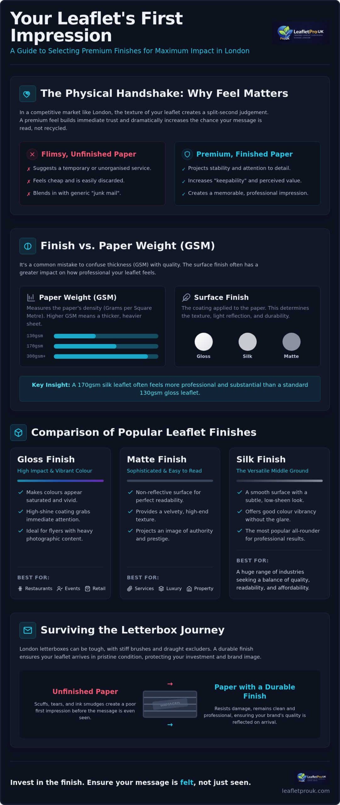
    Think of your leaflet as a physical handshake. When a resident picks it up from their mat, the tactile feedback tells them everything they need to know about your business before they read a single word. A flimsy, untreated flyer suggests a temporary or unorganised service. Conversely, a leaflet with a premium finish projects stability and attention to detail. This initial touch is the first step in building the trust required for a successful leaflet printing finishes London campaign.

    Beyond aesthetics, finishes provide a functional shield. London letterboxes often feature stiff draught excluders or heavy brushes that can easily scuff or tear unprotected paper. A durable finish ensures your message remains legible and professional, even after being pushed through a tight entrance. It prevents the ink from rubbing off on a recipient’s hands, maintaining the cleanliness and credibility of your brand throughout the distribution process.

    The Psychology of Tactile Marketing

    Premium textures significantly increase the “keepability” of your marketing material. When an item feels substantial, people are less likely to discard it immediately. This sensory input creates a stronger memory link than a digital advert. Amongst the clutter of daily post, a thicker, finished leaflet signals that your business is established and credible. High quality sensory input is directly linked to higher response rates because it makes the recipient feel that the offer is more valuable.

    Finishes vs. Paper Weight (GSM)

    It’s vital to distinguish between paper weight (GSM) and the surface finish. While GSM measures the actual thickness and weight of the paper, the finish determines the texture and light reflection. For high volume London postcode drops, a 170gsm silk leaflet often feels more professional than a 130gsm gloss one, despite being only slightly heavier. The silk finish offers a smooth, low-glare surface that makes contact details easier to read under domestic lighting. Choosing the right combination ensures your brand values are reflected in the physical product without unnecessary expenditure.

    Selecting the right leaflet printing finishes London involves balancing visual appeal with practical durability. The three industry-standard options, gloss, matte, and silk, each offer distinct advantages depending on your campaign goals. Choosing the wrong one can lead to poor readability or a flyer that looks worn before it even reaches the kitchen table. According to neuroscience studies on print marketing, the physical quality of your material directly affects brand recall, making this technical choice a vital part of your marketing strategy.

    Gloss Finish: High Impact and Vibrant Colour

    Gloss captures attention. It uses a high-shine coating that makes colours appear more saturated and vibrant. This finish is the standard choice for restaurant menus, event flyers, and retail promotions where photographic content is the primary focus. While it offers a brilliant look, it can produce significant glare under the bright lights of modern London flats. Fingerprint marks are also more visible on gloss surfaces, which might detract from the “clean” look of your brand if the leaflet is handled frequently.

    Matte Finish: Sophisticated and Easy to Read

    Matte is often the favourite for professional services, luxury brands, and high-end property agents. It provides a non-reflective, velvety surface that ensures your message is clear under any lighting condition. Readability is the greatest strength here. It’s vital to distinguish between matte paper and matte lamination; lamination is a premium plastic film that adds a significant layer of protection against scuffing. If you’re targeting affluent postcodes with a message of prestige, a matte laminated finish projects the necessary authority.

    Silk Finish: The Versatile Middle Ground

    Silk is the most popular choice for London door-to-door campaigns. It offers a smooth texture that sits comfortably between the shine of gloss and the flatness of matte. This balance provides excellent colour reproduction without the distracting glare, making it highly versatile for most business sectors. Silk is also the most practical choice if your campaign includes vouchers or “fill-in” forms. Unlike gloss, which repels most inks, silk surfaces are much easier to write on with a standard ballpoint pen.

    If you’re unsure which texture fits your brand values, our team at LeafletPro UK can provide guidance on the best combinations for your specific London postcode drop. Each finish has a different cost-benefit profile, but the goal remains the same: ensuring your leaflet looks as professional on the doormat as it did on the screen.

    Matching Your Finish to Your London Industry

    Selecting the right leaflet printing finishes London isn’t just a matter of personal taste. It’s a strategic decision rooted in the competitive landscape of your specific sector. In London’s high-density postcodes, where households receive a large volume of marketing, your flyer must immediately distinguish itself from generic “junk mail”. Aligning the physical texture of your leaflet with your digital brand presence ensures a seamless customer journey from the doormat to your website. For a deeper look at creating high-performing assets, consult our Effective Flyer Design and Print London: The 2026 Conversion Guide.

    Choosing a finish that contradicts your industry expectations can confuse potential customers. A luxury boutique using thin, high-gloss paper may inadvertently signal a discount brand. Conversely, a local service might find premium matte lamination too formal for a quick-service model. The goal is to match the physical expectations of your London audience with the professional standards of your trade.

    Estate Agents and Property Developers

    Property developers and estate agents dealing with high-value London listings must project authority and trust. Standard paper weights won’t suffice here. Using a 250gsm or 350gsm stock paired with matte lamination or Spot UV creates a premium “coffee table” effect. This ensures the material is kept for future reference rather than being immediately recycled. The tactile weight suggests a business that is established and capable of handling significant investments.

    Local Restaurants and Takeaways

    Local restaurants and takeaways rely on visual temptation to drive sales. Gloss finishes are particularly effective here because they make food photography look appetising and fresh by deepening the colour saturation. Practically, gloss also provides a layer of resistance against kitchen spills and grease, ensuring the menu remains legible in a busy household. To drive immediate orders, pair this vibrant finish with one of our 45+ Leaflet Call to Action Examples for London Sales 2026.

    Health, Beauty, and Wellness Centres

    Health, beauty, and wellness centres benefit from finishes that evoke a sense of calm and luxury. Soft-touch lamination is a popular choice for premium London spas as it feels velvety and sophisticated to the touch. For medical or dental practices, silk finishes provide a clean, modern, and professional look that aligns with a hygienic brand image. These speciality finishes act as a silent indicator of the high-quality service clients can expect at your clinic or studio.

    Leaflet Printing Finishes London: The 2026 Guide to Premium Campaign Quality

    The Impact of Finishes on Distribution Success and ROI

    High quality leaflet printing finishes London represent the first critical stage of any professional GPS-tracked campaign. Whilst many businesses view printing and distribution as separate silos, the physical integrity of your leaflet determines whether your tracking data translates into actual business results. A GPS report might confirm a flyer entered a building, but it cannot show if that flyer arrived in a crumpled, illegible state. Investing in premium finishes ensures that the high-level accountability we provide is matched by a high-level physical product that commands respect upon arrival.

    The relationship between paper quality and “door-to-bin” time is well-documented in local marketing. In high-density London postcodes, where residents are often overwhelmed by generic post, a leaflet that feels substantial is less likely to be immediately discarded. This perceived value extends the life of your marketing material, keeping it on a kitchen counter or fridge for longer periods, which naturally increases the likelihood of a conversion.

    Protecting Your Investment During the Drop

    The journey from a distributor’s bag to a London resident’s hallway involves significant mechanical stress. Many London properties feature heavy-duty letterbox brushes or stiff draught excluders that act like sandpaper on unfinished flyers. Flimsy, 130gsm uncoated paper often tears or scuffs during this process. Lamination acts as a protective skin, providing the structural rigidity needed to slide through narrow openings without damage. This protection also prevents ink transfer and smudging, which often occurs when hundreds of flyers are sorted and handled in high volumes before the drop.

    Maximising Response Rates with Premium Finishes

    Londoners are more likely to engage with a leaflet that “feels” expensive because tactile quality is subconsciously linked to brand credibility. When a recipient feels a smooth silk finish or a velvety soft-touch laminate, they associate that quality with your service standards. This is particularly important for businesses in competitive sectors like property or wellness, where trust is the primary barrier to sale. For a comprehensive look at how these physical assets integrate with our delivery systems, read our guide on GPS Tracked Leaflet Distribution: The Complete Guide to London Campaigns.

    LeafletPro UK manages this process end-to-end to guarantee that your premium flyers reach the right doormats in pristine condition. By combining professional print support with postcode-level targeting, we ensure your investment isn’t just delivered, but actually seen by your target audience. Our commitment to transparency through GPS tracking ensures you can verify every stage of your campaign’s physical journey across the capital.

    Why Choose LeafletPro UK for Your London Print and Distribution

    Choosing LeafletPro UK means partnering with a diligent team that understands the specific logistical challenges of the capital’s geography. We provide an integrated, end-to-end service that eliminates the friction between print production and physical delivery. By managing both stages, we ensure your chosen leaflet printing finishes London are perfectly suited to the demands of a high-volume distribution campaign. Our focus remains on providing a transparent, accountable service that turns your marketing investment into measurable local engagement.

    From Professional Design to Verified Delivery

    Successful campaigns begin with artwork that is technically optimised for its physical form. Our design support team works closely with you to ensure your graphics and typography complement your selected finish. For instance, we help adjust colour profiles to ensure they don’t lose vibrancy on silk stocks or become obscured by the high-shine glare of gloss coatings. This systematic approach ensures your brand’s visual identity remains consistent across every letterbox in your target postcode.

    Transparency is the cornerstone of our operations. We provide peace of mind through GPS-tracked delivery, offering a level of visibility that unorganised competitors simply cannot match. Because we focus exclusively on London residential marketing drops, we possess deep knowledge of local housing densities and access requirements. This specialised expertise allows us to organise postcode-targeted campaigns with surgical precision, ensuring your premium leaflets reach the right households without delay or damage.

    Get Started with Your High-Quality Campaign

    Initiating your next campaign is a straightforward process designed to respect your time and budget. We begin with a consultation to identify the perfect finish and paper weight for your specific industry and goals. Whether you require the rugged durability of gloss for a restaurant menu or the sophisticated touch of matte lamination for a property listing, we help you find the most cost-effective solution. You can request a comprehensive quote for our integrated print and distribution packages directly through our platform.

    Our commitment to your success extends beyond the physical drop. We act as a knowledgeable guide, simplifying complex logistics so you can focus on handling the increased response rates our campaigns generate. For a broader perspective on how we integrate these services, please explore our Professional Leaflet Design and Distribution London: The Complete 2026 Guide. When you’re ready to elevate your brand presence, visit LeafletPro UK to begin planning your high-impact London campaign.

    Elevate Your London Campaign with Premium Finishes

    Selecting appropriate leaflet printing finishes London is the first step in ensuring your marketing material survives the journey from the doormat to the kitchen table. We have explored how specific textures like matte lamination or high-gloss coatings protect your investment from the mechanical stress of letterbox brushes whilst establishing immediate brand credibility amongst residents. By aligning your physical product with your industry standards, you create a tactile experience that commands attention in high-density London postcodes where generic post is often ignored.

    Our end-to-end service integrates professional design support, high-quality printing, and GPS-verified distribution to provide 100% transparency for every drop. It’s a systematic approach that ensures your premium flyers are not only delivered but arrive in pristine condition to drive maximum response rates. Expert London postcode targeting allows you to focus your resources precisely where they’ll have the greatest impact on your ROI. Peace of mind comes from knowing every stage of the process is handled with professional scrutiny and care.

    We look forward to helping you build a campaign that reflects the true value of your business and delivers tangible results across the capital.

    Frequently Asked Questions

    What is the best leaflet printing finish for a London business?

    The ideal finish depends on your specific industry and campaign goals. Silk is often the preferred choice for general London campaigns because it offers a professional, low-glare surface that is easy to read under domestic lighting. Luxury brands often opt for matte lamination to project authority, whilst restaurants favour gloss to make food photography appear vibrant. Selecting the right leaflet printing finishes London ensures your brand values are communicated effectively upon the first touch.

    Does the finish of a leaflet affect the cost of distribution?

    The specific finish, such as gloss or matte, typically doesn’t influence the base cost of your distribution. However, the choice of finish often correlates with paper weight, which can affect the total weight of the delivery load. At LeafletPro UK, our distribution rates are primarily determined by the volume of leaflets and the specific London postcodes targeted rather than the aesthetic coating. This ensures you can choose the best finish for your brand without worrying about hidden delivery surcharges.

    What is the difference between silk and matte leaflet finishes?

    Silk finishes possess a slight sheen that enhances colour without the intense glare of high-gloss paper. Matte finishes are entirely non-reflective and provide a more understated, velvety texture. Whilst both are professional, silk is often more durable for high-volume handling during a door-to-door drop. Matte is frequently chosen for text-heavy leaflets or high-end services because it offers superior readability under the varying lighting conditions found in residential hallways and communal entrance areas.

    Can I write on a glossy leaflet if I have a voucher code?

    Writing on a high-gloss surface is difficult because the reflective coating repels most standard ballpoint inks. If your campaign requires customers to fill in a form or write a unique voucher code, we recommend choosing a silk or uncoated finish. These textures allow for much better ink absorption. This ensures that your call to action remains functional and that residents can easily engage with your offer without the frustration of smudged ink or illegible handwriting.

    How do I ensure my leaflets don’t get damaged during a London delivery?

    Protecting your materials requires a combination of adequate paper weight and a durable finish. London letterboxes often have stiff brushes that can scuff unprotected paper. Choosing a laminated finish, such as matte or gloss lamination, provides a protective layer that resists tearing and ink transfer. We also suggest using at least 170gsm paper to ensure the leaflet has the structural integrity to slide through narrow openings without crumpling or folding during the distribution process.

    Is Spot UV worth the extra cost for a local flyer campaign?

    Spot UV is highly effective for premium campaigns where you need to highlight specific design elements like a logo or a key offer. It applies a high-gloss varnish to selected areas of a matte-finished leaflet, creating a striking tactile contrast. Whilst it involves a higher production cost, the increased “keepability” and professional impact often lead to higher engagement rates. It is particularly valuable for London businesses in competitive sectors like property or high-end wellness centres.

    What paper weight (GSM) should I choose for a premium London drop?

    For a truly premium feel, we recommend choosing a paper weight between 250gsm and 350gsm. This thickness feels more like a card than a flyer, which immediately signals quality to the recipient. For high-volume postcode drops where budget is a factor, 170gsm silk provides a professional balance of durability and cost-effectiveness. The weight of the paper, combined with premium leaflet printing finishes London, determines how long your marketing stays in the home before being discarded.

    How does LeafletPro UK track the delivery of my high-quality flyers?

    We provide 100% transparency through our systematic GPS-tracked delivery process. Every distributor carries a tracking device that records their exact route as they move through your targeted London postcodes. Once the campaign is complete, you receive a detailed report showing the verified coverage of your drop. This evidence-based approach ensures that your high-quality flyers have actually reached the intended doormats, giving you peace of mind that your investment is being handled with professional scrutiny.

  • 45+ Leaflet Call to Action Examples for London Sales 2026

    45+ Leaflet Call to Action Examples for London Sales 2026

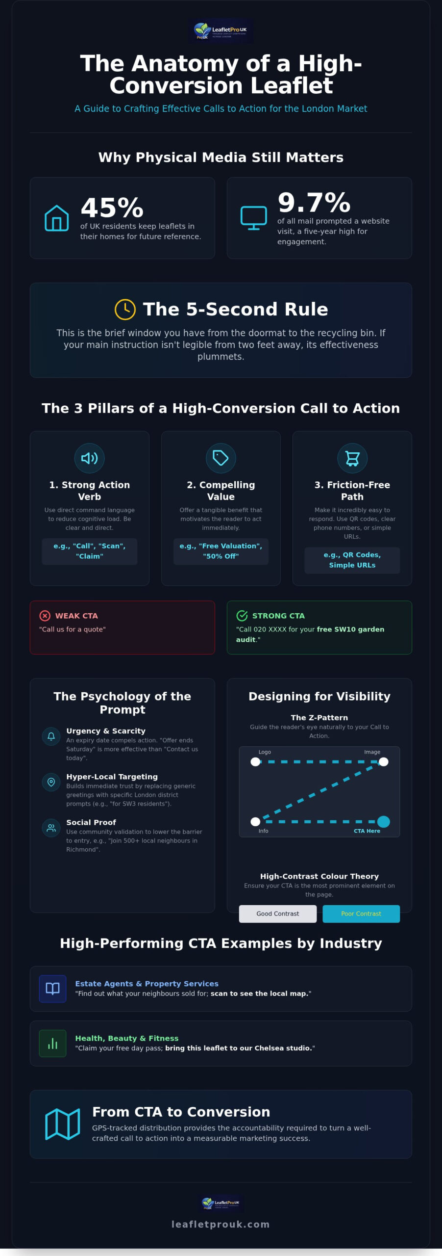
    Did you know that 45% of UK residents keep leaflets in their homes for future reference? Whilst it’s easy to assume that physical mail gets lost in the “junk” pile, the reality is that 9.7% of all mail prompted a website visit in late 2025, marking a five-year high for engagement. You likely understand the frustration of a campaign that fails to land, especially when you can’t be certain if your flyers even reached the doormat. We agree that a professional distribution strategy is worthless if your message doesn’t compel the reader to act immediately.

    In this guide, we promise to provide you with over 45 high-conversion leaflet call to action examples specifically tailored for the competitive London market in 2026. You’ll discover how to move beyond generic phrases and utilise hyper-local postcode prompts that resonate with residents in specific boroughs. We will preview the essential design principles that make your CTA pop and explain how GPS-tracked delivery ensures your investment translates into measurable results. From discount codes to digital-physical integrations, you’ll gain the exact tools needed to transform your next London drop into a high-performing sales channel.

    Key Takeaways

    • Understand why physical CTAs require a distinct psychological approach compared to digital buttons to effectively bridge the gap between the doormat and the checkout.
    • Access a curated list of over 45 leaflet call to action examples categorised by industry to inspire your next high-performing London campaign.
    • Learn how hyper-local postcode targeting builds immediate trust with residents by replacing generic greetings with specific London district prompts.
    • Master visual design techniques, including the Z-pattern and high-contrast colour theory, to ensure your call to action remains the focal point of your flyer.
    • Discover how GPS-tracked distribution provides the accountability required to turn a well-crafted CTA into a measurable marketing success.

    The Anatomy of a High-Conversion Leaflet Call to Action

    A Call to action (CTA) serves as the vital bridge between your marketing message and the customer’s eventual purchase. Unlike a digital button that allows for instant clicking, a physical leaflet requires a more robust psychological nudge. You aren’t just asking for a click; you’re asking a London homeowner to pause their routine and engage with a physical object. To succeed, your leaflet call to action examples must balance three core pillars: a strong action verb, a compelling value proposition, and a friction-free method of contact. If any of these elements are missing, the bridge breaks. For instance, “Call us for a quote” is significantly weaker than “Call 020 XXXX for your free SW10 garden audit.”

    In the fast-paced London environment, your flyer faces the “5-second rule.” This is the brief window of time it takes for a resident to walk from their front door to the recycling bin. If the primary instruction isn’t legible from a distance of at least two feet, the campaign’s effectiveness drops. Clarity is the foundation of credibility. If a reader has to hunt for the phone number or website amongst the graphics, they will likely move on. We prioritise a layout where the CTA is the most prominent element on the page, ensuring the path to conversion is unmistakable.

    The Psychology of the Prompt

    Direct command language reduces cognitive load for the busy London homeowner. Clear instructions like “Bring this flyer to our Chelsea shop” or “Scan for your SW3 discount” perform better than passive suggestions. We recommend using urgency to drive immediate behaviour. Whilst research shows 45% of UK residents keep leaflets for future reference, an expiry date ensures that “future” becomes “today.” Phrases such as “Offer ends Saturday” create a necessary sense of scarcity that “Contact us today” simply lacks.

    Choosing Your Conversion Path

    Selecting the right path depends on your specific business goals and target borough. Direct response remains ideal for local tradespeople; a prominent phone number encourages immediate local trust. Digital bridges, such as QR codes, are now essential for linking physical media to London-specific landing pages. This allows for precise tracking of ROI. Finally, social proof prompts like “Join 500+ local neighbours in Richmond” use community validation to lower the barrier to entry. By combining professional leaflet design support with these leaflet call to action examples, you ensure your message isn’t just seen, but acted upon.

    45+ Leaflet Call to Action Examples Categorised by Industry

    Generic instructions often result in poor engagement because they fail to address the specific needs of a local audience. To achieve high response rates, your prompts must align with the effective flyer design and print London principles, ensuring the instruction is both visually clear and contextually relevant. Industry data highlights the effectiveness of direct mail when the message provides immediate, tangible value to the recipient. These leaflet call to action examples are designed to cut through the noise of a busy London household by offering clear, low-friction next steps.

    Estate Agents and Property Services

    Property marketing relies on establishing local authority and trust. Your CTA should offer expertise that a homeowner cannot find through a simple web search.

    • “Book your free SE1 property valuation today; call [Number].”
    • “Find out what your neighbours sold for; scan to see the local map.”
    • “Thinking of moving in 2026? Get our free local market report.”
    • “Register for off-market SW19 listings; text ‘HOME’ to [Number].”
    • “Claim your free landlord compliance checklist; visit [URL].”

    Health, Beauty, and Fitness

    For wellness businesses, the goal is to lower the barrier to entry. Using physical leaflets to offer “taster” experiences is a proven method for building a local client base.

    • “Claim your free day pass; bring this leaflet to our Chelsea studio.”
    • “First haircut half price; book online using code LONDON50.”
    • “Start your 6-week transformation; only 10 spots left for [Neighbourhood] residents.”
    • “Scan for a virtual tour of our new Islington spa.”
    • “Bring a friend for free this Friday; show this flyer at reception.”

    Restaurants, Cafes, and Local Shops

    Hospitality CTAs should focus on immediate gratification and community exclusivity. Postcode-specific offers make residents feel like “local insiders.”

    • “Dinner is on us; Buy one main, get one free this Tuesday.”
    • “Scan for our secret local menu; only for our [Postcode] neighbours.”
    • “Show this flyer at the till for a free coffee with any pastry.”
    • “Book your Sunday Roast table; call 020 XXXX to secure your spot.”
    • “Get 20% off your first takeaway order; use code LOCAL20.”

    These leaflet call to action examples work most effectively when they are delivered with precision. To ensure your message reaches the correct doormats, it is essential to partner with a professional leaflet distribution company that understands the nuances of London’s diverse boroughs. By combining a compelling offer with verified delivery, you can transform a simple flyer into a reliable lead-generation tool for your business.

    Hyper-Local CTAs: Using London Postcodes for Better Response

    In London’s dense urban market, generic greetings like “Dear Neighbour” often feel like mass-produced noise. Residents are more likely to engage when they feel a message is crafted specifically for their street or borough. By using hyper-local identifiers, you transform a standard marketing piece into a community-relevant notice. This approach taps into the psychology of effective calls to action, where familiarity breeds trust and reduces the mental friction of responding. When a resident sees their own postcode on a flyer, the perceived relevance of the offer increases immediately.

    The Postcode Power Play

    Mentioning a specific postcode district, such as “Attention SW19 Residents,” immediately anchors your service in the reader’s physical reality. This level of precision is most effective when paired with household targeted leaflet distribution London, ensuring your flyers reach high-density areas where your service is most needed. You don’t just want a broad reach; you want a relevant reach. Consider these leaflet call to action examples that leverage local geography:

    • “Exclusive N1 residents discount: 20% off your first booking.”
    • “Free lawn health checks for TW9 homeowners this week.”
    • “New boutique opening near Victoria Park; scan for your opening night invite.”

    Mentioning a local street or a well-known park increases the “keepability” of a leaflet. Residents are less likely to discard a flyer that mentions their specific micro-neighbourhood, as it feels like a bespoke service rather than a cold solicitation.

    Trust through Local Presence

    Trust is the currency of the London doormat. Proving you are a genuine local entity rather than a faceless national chain can significantly boost response rates. One effective method is referencing local landmarks or transit hubs to provide a mental map for the customer. A CTA like “Visit us on the High Street, just a 2-minute walk from Angel Station” makes the visit feel convenient and low-risk. It tells the reader exactly where you are without them needing to open a map app.

    Historical presence also matters in a city that is constantly changing. Using phrases like “Serving the Bromley community since 2010; see our local reviews” provides the credibility residents look for. Additionally, using a traditional 020 landline number rather than a mobile number reinforces a sense of permanence and professional standards. Whilst mobile numbers are common, the London landline suggests an established office or shopfront. These subtle leaflet call to action examples work because they provide the tangible proof Londoners require before picking up the phone.

    Finally, remember that London’s 33 boroughs have vastly different demographics. A CTA for a luxury service in Chelsea should focus on “Bespoke consultations for SW3 residents,” whereas a student-focused offer in Camden might use “Flash this flyer for a free drink.” Tailoring your language to the specific borough ensures your message resonates with the local culture and economic profile of the area.

    45+ Leaflet Call to Action Examples for London Sales 2026

    Designing Your CTA for Maximum Visibility

    A well-crafted message only works if the reader’s eye is physically led to it. Most London residents scan a piece of mail in less than five seconds before deciding its fate. To capture this brief window of attention, you must utilise established reading patterns. The Z-pattern is particularly effective for flyers with minimal text, guiding the eye from the headline across the page and down to the bottom-right corner. This is where your primary leaflet call to action examples should be positioned for maximum impact. If your design is more information-heavy, an F-pattern layout ensures the reader encounters your instruction whilst scanning the left-hand margin.

    Colour theory plays a vital role in making your instruction stand out against the background. We recommend using high-contrast colour pairings that separate the CTA from the rest of the design. For example, a bright orange action button on a deep blue background creates a visual vibration that is difficult to ignore. Typography should follow a similar logic of clarity. Bold, sans-serif fonts are the standard for action words because they remain legible even in low light or from a distance. Clutter is the ultimate enemy of conversion; using “white space” around your CTA ensures the message isn’t swallowed by secondary graphics or lengthy paragraphs.

    QR Codes: The Modern CTA

    QR codes have become the standard for linking physical media to digital results. To ensure your QR code is doormat-friendly, place it at least 2cm away from the edge of the flyer to prevent it from being clipped during the high-quality printing process. Always include a clear “Scan Me” instruction alongside the code to remove any ambiguity. For a sophisticated London campaign, we suggest creating unique landing pages for different postcodes. This allows you to track exactly which boroughs are generating the most engagement, providing the data needed to refine your future distribution strategy.

    Visual Cues and Directional Elements

    Directional elements act as silent guides for the reader. Using arrows that point toward your phone number or website can increase response rates by physically directing the eye to the next step. If your leaflet includes photography of people, ensure their eyeline is directed toward the CTA text rather than looking off-page. For limited-time offers, a “burst” or “sticker” effect can highlight a discount whilst creating a sense of urgency. Visual hierarchy is the strategic arrangement of design elements to lead the reader’s eye toward the conversion point, serving as the hidden engine behind physical marketing ROI.

    Measuring Success: From CTA to GPS-Tracked Conversion

    A persuasive message is only a theoretical success until it physically reaches the doormat. We prioritise transparency because we understand that even the best leaflet call to action examples fail if the distribution process lacks integrity. To accurately calculate your response rates, you need a verified “denominator”, which is the exact number of homes that received your flyer. This is why GPS tracked leaflet distribution serves as the essential baseline for measuring marketing effectiveness. Without tracked proof, you cannot distinguish between a flawed creative strategy and a failure in the logistical delivery chain.

    Measuring response requires a systematic approach to data collection. You should utilise unique tracking mechanisms for every campaign, such as dedicated phone numbers or borough-specific promo codes. Dedicated URLs or QR codes that lead to hidden landing pages are particularly effective for London businesses looking to segment their results. These tools allow you to attribute every lead to a specific drop, providing the evidence needed to justify your marketing spend. If a low response rate occurs despite 100% verified delivery, you’ll know it’s time to adjust the offer or the design rather than the distribution partner. This systematic verification ensures that every marketing decision is based on tangible results rather than vague assumptions.

    The Accountability Standard

    Our commitment to visibility ensures you never have to guess about the status of your campaign. By using GPS reports to verify that every letterbox in your targeted London postcodes was reached, you gain the peace of mind that your investment was handled with precision. You can cross-reference these delivery timestamps with spikes in your website traffic or incoming enquiries to see the immediate impact of your drop. This data-driven approach helps you avoid common leaflet marketing mistakes London companies face when they rely on unverified “blind” drops. Accountability is not just a feature; it is the baseline for professional marketing standards.

    A/B Testing Your CTAs

    The diversity amongst London’s boroughs provides a unique opportunity to refine your leaflet call to action examples through A/B testing. You might test a “20% off” offer in Wandsworth whilst running a “Buy One Get One Free” promotion in a demographically similar area of Battersea. GPS data ensures these test zones are truly comparable in terms of housing density and economic profile. By analysing the results from these two distinct areas, you can identify which psychological trigger resonates most with your target audience. Scaling your success becomes a logical, methodical process once you have identified the highest-performing prompt through rigorous local testing.

    Optimising Your London Marketing Strategy for 2026

    A successful campaign requires more than just a creative headline; it demands a systematic integration of clear visual hierarchy, hyper-local messaging, and verifiable delivery. By applying these leaflet call to action examples, you can effectively bridge the gap between a resident’s doormat and your business’s bottom line. We’ve established that trust in the London market is built through accountability and professional standards. Specialist London postcode targeting ensures your message reaches the intended demographic, whilst dedicated design support ensures your instruction remains the focal point of every flyer.

    Physical marketing in 2026 is no longer a matter of guesswork. With GPS-tracked delivery data provided for every campaign, you can move forward with the confidence that your investment is being handled with absolute integrity. It’s time to transform your flyers into reliable sales tools that drive measurable results across the capital.

    Frequently Asked Questions

    What is the best call to action for a local business leaflet?

    The most effective call to action for a local business is one that combines a clear command with a tangible local benefit. For instance, “Book your free Richmond boiler service” is superior to a generic “Call us.” We recommend focusing on a low-friction entry point that addresses a specific need within your London borough. This approach reduces the mental effort required for the resident to take the next step towards your business.

    How many CTAs should I include on a single flyer?

    You should generally stick to one primary call to action to avoid confusing the reader. Whilst it’s tempting to offer multiple contact methods, a single dominant instruction typically yields higher response rates. If you must include a secondary option, ensure it doesn’t compete for visual attention. A clear hierarchy allows the London homeowner to understand exactly what they need to do within the first few seconds of engagement.

    Does a QR code work better than a phone number on a leaflet?

    QR codes and phone numbers serve different demographic preferences, so the best choice depends on your target London audience. Younger residents often prefer the speed of a QR code that links to a mobile-optimised landing page. Conversely, older homeowners or those seeking urgent local services may prefer a traditional 020 landline number. We suggest including both to ensure you don’t exclude potential customers based on their preferred communication method.

    How can I track how many people responded to my leaflet campaign?

    Tracking response rates is best achieved through unique identifiers like borough-specific promo codes or dedicated landing page URLs. By assigning a different code to each London postcode drop, you can precisely measure which areas generate the most leads. You can also use dedicated tracking phone numbers. These methods provide the hard data needed to refine your leaflet call to action examples for future campaigns and calculate your exact ROI.

    What words should I avoid in a leaflet call to action?

    Avoid passive or vague language like “Click here” or “Contact us for more details.” These phrases lack a value proposition and fail to motivate immediate action. You should also steer clear of overly aggressive sales jargon that can appear untrustworthy to London residents. Instead, use active verbs that promise a benefit, such as “Claim,” “Discover,” or “Receive,” which feel more like an invitation than a hard sales pitch.

    How do I make my CTA stand out on a crowded leaflet design?

    Making your instruction stand out requires the strategic use of high-contrast colours and generous white space. If your design is crowded, the eye won’t know where to land, which often leads to the flyer being discarded. Use a bold, sans-serif font for your primary action word and ensure it’s at least 20% larger than the surrounding body text. Our design support team focuses on creating this visual hierarchy to ensure your message pops.

    Is it better to put the CTA on the front or the back of the leaflet?

    You must place your primary call to action on the front of the leaflet to ensure it’s seen immediately upon delivery. Since many flyers are scanned whilst walking from the doormat to the bin, you cannot rely on the reader turning the page over. However, repeating a secondary version of the CTA on the back can reinforce the message for those who take the time to read the full content of your leaflet call to action examples.

    How do I know if my leaflets were actually delivered in London?

    The only reliable way to verify delivery is through GPS-tracked distribution reports that show the exact route taken by the distributor. At LeafletPro UK, we provide this transparent data for every campaign we handle across London. This reporting allows you to see exactly which streets were reached and at what time. It eliminates the industry anxiety regarding “blind” drops and provides the accountability you need for your marketing investment.

  • Effective Flyer Design and Print London: The 2026 Conversion Guide

    Effective Flyer Design and Print London: The 2026 Conversion Guide

    How many thousands of pounds are currently sitting at the bottom of recycling bins across Greater London because a marketing campaign lacked accountability? It’s a common frustration for many business owners who feel that physical marketing is a black hole where budgets disappear without a trace. You likely understand that whilst a well-crafted message is vital, the logistical gap between a printer and a potential customer’s doormat often feels impossible to bridge with any real certainty. Managing separate designers, printers, and distributors only adds to the complexity and risk of your investment.

    This guide will show you how to master effective flyer design for distribution London by integrating professional aesthetics with rigorous, GPS-verified delivery systems. You’ll learn how to stop guessing and start seeing tangible response rates from your most valuable local postcodes. We will explore the critical design elements that prevent your materials from being discarded and explain how transparent tracking ensures every penny of your marketing spend is accounted for. By the end of this article, you’ll have a clear roadmap for creating physical marketing that commands attention and delivers verified results in the competitive 2026 market.

    Key Takeaways

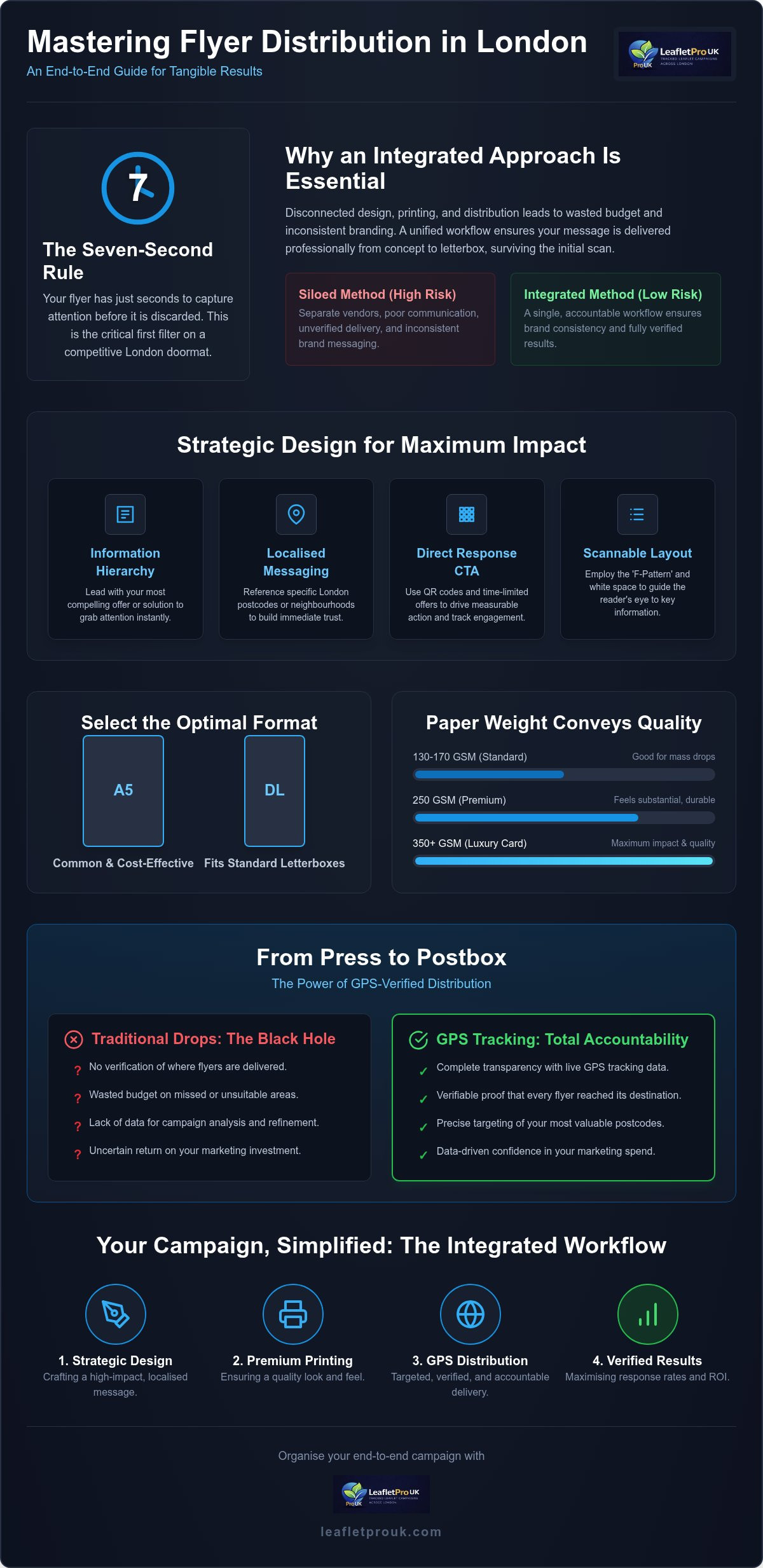
    • Understand why integrating design, print, and distribution into a single workflow prevents campaign failure and ensures brand consistency from concept to doormat.
    • Master the “Seven-Second Rule” and information hierarchy to create effective flyer design for distribution London that captures attention before it reaches the recycling bin.
    • Learn how to select the optimal paper weight and format, such as A5 or DL, to balance a premium feel with cost-effective delivery across London postcodes.
    • Discover how GPS-tracked distribution provides complete transparency, allowing you to verify that every flyer has reached its intended destination with absolute precision.
    • See how an end-to-end management approach saves time and reduces the logistical hassle of coordinating multiple vendors for your local marketing campaigns.

    The London Doormat Challenge: Why Design and Print Integration Matters

    The competition on a London doormat is exceptionally high. On any given day, a resident in Fulham or Islington might find several pieces of mail waiting for them. This environment has birthed the “Seven-Second Rule”, a critical window where a recipient decides to either keep your flyer or move it directly to the recycling bin. Achieving effective flyer design for distribution London isn’t just about aesthetics; it’s about surviving this initial filter through immediate visual impact and physical quality.

    Many campaigns fail because they treat design, print, and distribution as separate silos. When these elements aren’t aligned, the results are often disappointing. A designer might create a beautiful layout that doesn’t account for the physical “grip” required by a distributor, or a printer might use ink that smudges in the damp London air. When these phases don’t communicate, you risk a final product that looks unprofessional by the time it reaches the customer. An integrated approach ensures that the visual strategy matches the logistical reality of the city’s letterboxes.

    London Household Behaviour in 2026

    Londoners’ decision-making processes have become increasingly refined. In high-density areas like Hackney or Wandsworth, communal entrances and shared hallway tables create a “bin-adjacent” sorting culture. If your flyer feels flimsy or looks like a generic national advertisement, it’s unlikely to make it past the front door. High-quality paper weights and London-centric messaging are essential for building trust. Referencing specific local postcodes or neighbourhood landmarks signals that your business is part of the community, which significantly outperforms one-size-fits-all marketing templates.

    The Synergy of Professional Design and GPS Delivery

    The physical condition of your marketing material speaks volumes about your brand’s standards. A crisp, uncreased flyer delivered through a letterbox suggests a professional and diligent business. However, visual quality is only half the battle. Without GPS verification, you’re essentially operating in the dark. Integrating effective flyer design for distribution London with GPS-tracked delivery from a specialist provider like LeafletPro UK provides the accountability that London businesses need. It moves the campaign away from unverified mass drops and toward targeted precision, where every delivery is logged and verified. This systematic approach ensures that your investment is protected and your reach is proven by data rather than vague promises.

    Strategic Flyer Design for Maximum Response Rates

    Creating effective flyer design for distribution London requires a strategic hierarchy that respects the recipient’s limited time. Your primary message must be visible within the first second of contact. This means your headline shouldn’t be your company name; it should be your most compelling offer or solution. If you provide a service in a specific borough, mentioning that location prominently creates an instant connection and increases the likelihood of the flyer being kept. Londoners respond best to messaging that feels tailored to their specific neighbourhood rather than a generic city-wide blast.

    A “Direct Response” call-to-action (CTA) is the engine of your campaign. In a local context, this might be a time-limited discount or a specific invitation to a local event. To bridge the gap between physical and digital, QR codes are indispensable. They provide a frictionless path to your website whilst allowing you to track exactly which postcodes are driving traffic. This data-led approach ensures you can refine your strategy for future drops. Colour choice also plays a role in standing out amongst the morning post. High-contrast schemes often work better than muted tones, provided they align with your brand’s professional identity and don’t feel visually aggressive.

    Layout Essentials for Quick Scanning

    The “F-Pattern” is a proven layout strategy for A5 and A6 leaflets. Readers typically scan across the top, then down the left side, and across the middle. Placing your most vital information along these paths ensures it’s seen. White space is equally important. In a cluttered London environment, a clean design suggests a well-organised business. Using bold typography to highlight specific boroughs, such as “Serving Greenwich since 2010”, immediately signals local relevance and authority. It’s about making the information as easy to digest as possible during that short walk from the front door to the kitchen table.

    Trust Signals and Credibility

    Londoners are naturally discerning and often skeptical of unsolicited mail. Including trust signals like customer reviews or local industry certifications can mitigate this. A physical London address on the design provides a sense of permanence and accountability that a mobile number alone cannot offer. You can also include a “GPS Verified” badge on your artwork. This signals to the recipient that your business values transparency and systematic execution, which sets you apart from less organised competitors. Incorporating these elements is a fundamental part of effective flyer design for distribution London, as it moves the conversation from a vague promise to a credible offer. If you’re unsure how to balance these elements, seeking professional design support can help ensure your flyer communicates reliability from the moment it’s picked up.

    Selecting Premium Print Specifications for London Campaigns

    A well-executed layout is only as strong as the substrate it is printed on. When your marketing material arrives on a London doormat, the recipient’s first impression is tactile rather than visual. Choosing the right paper stock is a logistical decision that directly impacts the success of your effective flyer design for distribution London. If the paper feels flimsy or cheap, the brand perception follows suit. Conversely, a substantial, high-quality flyer suggests a business that is established and dependable.

    The Perceived Value of Paper Stocks

    For most professional London distributions, 150gsm (grams per square metre) is considered the industry sweet spot. It provides enough rigidity to survive the journey through a letterbox without creasing, yet it remains cost-effective for high-volume campaigns. If you are operating in premium sectors such as luxury real estate or high-end home renovations, moving to a 250gsm or 300gsm card stock can significantly elevate your brand’s authority. These heavier weights feel more like an invitation than an advertisement, which often leads to higher retention rates in affluent postcodes.

    The choice of finish also dictates how your message is received. Silk finish is frequently the preferred choice for London businesses because it reduces glare and resists fingerprints, ensuring the text remains legible under various lighting conditions. Whilst gloss finishes can make colours appear more vibrant, they can sometimes feel overly commercial or “loud.” A silk or matt finish often projects a more sophisticated, modern aesthetic that aligns with contemporary London design trends. Selecting the right “feel” ensures your flyer is not just seen, but respected as a professional piece of communication.

    Sustainability in 2026 Print

    Environmental responsibility is no longer a niche concern; it’s a core expectation for many Londoners. Utilising FSC-certified paper stocks is a transparent way to demonstrate your brand’s commitment to ethical sourcing. In 2026, the quality of recycled paper has reached a point where it is virtually indistinguishable from virgin stock in terms of vibrancy and durability. You can even turn these “green” credentials into a design feature by including a small sustainability mark on your artwork. This builds immediate rapport with eco-conscious residents and positions your business as a forward-thinking entity. By combining high-quality printing with sustainable practices, you create a marketing tool that is both effective and ethically sound.

    Effective Flyer Design and Print London: The 2026 Conversion Guide

    From Press to Postbox: Integrating Print with GPS-Tracked Distribution

    Many London businesses invest heavily in high-end production only to falter at the final hurdle: delivery. Even the most effective flyer design for distribution London loses its value if it never reaches the intended doormat. This is where GPS tracking becomes a non-negotiable standard for any high-volume campaign. It provides a level of transparency that replaces vague assurances with hard data. By integrating your print process with a verified distribution network, you ensure that your marketing spend is protected by a systematic audit trail.

    A GPS distribution report shouldn’t be a confusing map of lines; it’s a tool for business owners to verify coverage and identify gaps. You should look for consistent track logs that mirror the street layout of your targeted London postcodes. This data also allows for sophisticated A/B testing. You might distribute a design featuring luxury imagery to affluent SW postcodes whilst using a more value-driven layout in emerging areas. By linking specific designs to tracked routes, you can accurately measure which creative approach generates the highest response. This logistical precision is what separates a professional campaign from a generic mail drop.

    Understanding Postcode Targeting

    London’s geography is unique, with residential streets often sitting directly adjacent to strictly commercial zones. Effective distribution requires excluding industrial estates or office blocks where flyers are likely to be discarded by receptionists. This precision ensures your print quantities are optimised for households, reducing wastage and increasing the density of your reach. To refine your strategy further, you can learn more about targeted leaflet drops in London and how they maximise local engagement.

    Accountability in Distribution

    The “GPS Proof” standard is the antidote to industry-standard “blind” delivery. At LeafletPro UK, we provide comprehensive tracking as a standard feature, ensuring 100% doormat coverage across your chosen areas. This level of accountability has saved numerous London businesses from wasted budgets. For example, a local restaurant recently used our GPS data to identify that a specific neighbourhood was under-performing despite high delivery rates. This allowed them to pivot their effective flyer design for distribution London to a different demographic, ultimately doubling their redemption rate. Whether you choose a “Solus” drop for maximum impact or a “Shared” drop for cost-efficiency, verification remains the core of our process.

    Organising Your End-to-End Campaign with LeafletPro UK

    Managing separate designers, printers, and distributors often creates unnecessary friction and increases the risk of campaign failure. LeafletPro UK provides a streamlined solution by acting as your single point of contact for the entire process. This integrated model ensures that the strategic goals established during the design phase are carried through to the physical print and final delivery. By maintaining oversight from concept to doormat, we eliminate the communication gaps that often lead to delays or quality issues. You gain a partner who is responsible for the entire workflow, allowing you to focus on managing the resulting enquiries.

    Our methodology is built on a foundation of local expertise. National agencies often apply a generic template to every city, but we focus exclusively on the London market. We understand the specific demographic profiles of different boroughs and how these should influence your effective flyer design for distribution London. Our process begins with detailed postcode mapping to identify your ideal audience and ends with a comprehensive GPS report that verifies every delivery. This systematic approach provides the accountability that modern businesses require, moving beyond vague promises to evidence-based results.

    Professional Design Support

    Working with our in-house team allows you to refine your layout for maximum engagement. We ensure your brand voice remains consistent whilst optimising the visual elements for the London letterbox. This design phase is directly integrated with our GPS tracked distribution service, ensuring that the final product is built for the specific logistical path it will take. By considering the physical journey during the design stage, we help you avoid common pitfalls like illegible text or poor colour contrast in low-light hallways. This synergy between creative and logistical planning is essential for achieving a high return on investment.

    Peace of Mind Delivery

    The LeafletPro UK guarantee is rooted in transparency and reliability. We focus exclusively on London residential doormats, avoiding the wastage associated with commercial drops or unverified distribution methods. This specialisation allows us to provide a service that is both targeted and reliable. Every campaign is backed by GPS evidence, giving you absolute certainty that your materials have reached their destination. To begin briefing your first 2026 campaign, you can reach out to our team to discuss your specific goals. We will guide you through the mapping process and provide a custom quote for an integrated design, print, and distribution package tailored to your postcode requirements.

    Securing Your Competitive Edge in the London Market

    Mastering the transition from a digital concept to a physical doormat requires a blend of creative strategy and logistical precision. You’ve seen how integrating high-quality print specifications with rigorous delivery standards eliminates the typical “blind spots” of traditional marketing. By focusing on effective flyer design for distribution London, you ensure your message doesn’t just reach the letterbox but commands the attention of your specific target demographic. This level of coordination is what defines a professional presence in the capital.

    Accountability is the foundation of every successful campaign in 2026. Utilising GPS-tracked delivery reports for every drop provides the transparency you need to verify your return on investment with absolute certainty. Our comprehensive design-to-doormat service is built on years of London postcode targeting expertise, ensuring your brand stands out in the capital’s most competitive neighbourhoods. It’s time to move away from unverified mass drops and embrace a systematic approach that delivers tangible, verified results. You deserve a marketing partner that values evidence over empty promises.

    We look forward to helping you transform your local engagement with a campaign that is as reliable as it is impactful.

    Frequently Asked Questions

    How much does flyer design and print in London typically cost?

    Costs depend on several variables, including your choice of paper weight, the total volume required, and the level of design support needed. Whilst it’s tempting to seek the lowest price, a poorly printed flyer often results in lower response rates. We focus on providing a transparent, integrated service where the cost reflects the professional standards and systematic verification required for a successful London campaign. Requesting a custom quote ensures the pricing aligns with your specific postcode targets.

    What is the best flyer size for door-to-door distribution in London?

    A5 remains the most popular and effective choice for residential drops because it provides enough surface area for a clear information hierarchy and a compelling call-to-action. DL formats are also highly effective for premium service sectors, as they often stand out amongst standard post. Your choice should depend on your brand’s aesthetic and the amount of detail required to communicate your offer clearly to London households without appearing cluttered or unprofessional.

    How long does a full design, print, and distribution campaign take to launch?

    A comprehensive campaign generally takes between one and two weeks to move from the initial briefing to the first doormat. This timeline allows for a professional design phase, followed by high-quality printing and logistical scheduling. We prioritise a methodical approach to ensure that every aspect of the campaign, from postcode mapping to GPS setup, is executed with the precision necessary for a high-impact launch across your chosen London neighbourhoods.

    Can I provide my own design for you to print and distribute?

    You are welcome to submit your own artwork, provided it meets our technical print specifications. Our team will conduct a professional review to ensure the layout is optimised for effective flyer design for distribution London. We look for elements like clear typography and a strong local message that will resonate with residents in your chosen boroughs. If adjustments are needed to improve conversion, we will provide guidance before proceeding to the printing stage.

    How do I know my flyers have actually been delivered in London?

    We eliminate the uncertainty of physical marketing by providing detailed GPS tracking reports as a standard feature of every campaign. These reports show the exact routes taken by our distributors, offering transparent proof that your materials have reached every intended doormat. This systematic verification process ensures complete accountability and gives you the confidence that your marketing budget is being utilised with maximum efficiency across your specifically targeted London areas and postcodes.

    What is the minimum quantity for a GPS-tracked London campaign?

    Minimum quantities are determined by the specific density of your chosen London postcodes and whether you select a Solus or Shared distribution model. We focus on providing targeted precision, so we work with you to establish a volume that ensures meaningful reach within a specific neighbourhood. This approach prevents wastage and ensures that your campaign maintains the high professional standards required for a successful local engagement strategy in the competitive London market.

    Should I choose gloss or matt finish for my London leaflets?

    Whilst gloss is vibrant, a silk or matt finish is often the more sophisticated choice for modern London campaigns. Silk finishes are particularly effective because they resist fingerprints and reduce glare, ensuring your message remains professional and legible even in dimly lit residential entrances. This tactile quality contributes to the perceived value of your brand and helps your flyer survive the transition from the letterbox to the recipient’s kitchen table.

    Do you offer hand-to-hand distribution in Central London?

    Our services are focused exclusively on door-to-door residential distribution within the London area. We don’t offer hand-to-hand or street-level distribution because residential drops offer a more tangible and lasting connection with the recipient. By delivering directly to the home, your marketing materials have a much higher chance of being kept and acted upon. This focus allows us to maintain the highest levels of GPS-tracked accountability and precision for every client.