A flyer can look polished and still leave readers unsure what to do next. A call to action (CTA) clearly tells them what step to take, such as booking, calling or visiting a website. Creating a compelling call to action for flyers means making that step specific, easy to understand and relevant to the reader.
It pays to be deliberate with your wording: vague instructions leave people guessing, while pressure-heavy language can undermine trust. A strong CTA doesn’t need to shout. It gives readers a clear reason to act and makes the next step straightforward.
This guide explains how flyer calls to action work, offers examples for different goals and shows how to make your wording clear without inventing urgency. You’ll also learn practical ways to test different versions and use reader responses to inform your choices.
Key Takeaways
- Make the next step specific and easy to understand, so readers know exactly what to do.
- Give people a genuine reason to act, rather than relying on vague urgency or pressure.
- Compare different CTA wording and track responses to learn which version works better.
- Use clear, concise wording and make the main action stand out in the design.
- UK Government guidance recommends keeping the CTA clear, using few words and placing at least 1 CTA near the top.
Avoiding generic, urgent, or anxiety-driven CTA wording
A call to action works when it tells readers what to do and why that step is useful. “Book a free 15-minute consultation” is clearer than “Find out more” because it names an action and a benefit.
Use this simple formula: action verb + reader benefit + optional urgency. For example, “Download the menu to plan your visit” gives readers a clear action and reason. Add “today” only when acting today genuinely matters to the offer or campaign.
A relevant benefit gives readers a reason to pay attention. A local event flyer could say, “Register for early-bird access”, while a home-services flyer might say, “Book a visit to discuss your project”. Each example connects the action to a specific need instead of asking everyone to “click here”.
Clarity also depends on what happens after someone responds. If a flyer promotes a downloadable guide, say “Download the garden-planning guide”, not “Unlock your potential”. Use the same offer name and wording on the landing page, so readers recognise the promise when they continue online.
Urgency is appropriate when it reflects a real limit. If exactly 10 places remain for an event, “Reserve one of the 10 remaining places” communicates a specific reason to act. If there’s no genuine deadline, stock limit or capacity constraint, leave out claims such as “last chance” and “while places last”.
Exclusivity can be persuasive without pressure when it reflects a genuine audience or offer. For example, a residents’ association could invite local households to “Claim your neighbourhood event pass”. This gives readers a relevant reason to respond without suggesting they’ll miss an opportunity that doesn’t exist.
- Situation: A café wants nearby residents to try its lunch menu. Action: Use “View the lunch menu”. Result: Readers know what to open and what they’ll see.
- Situation: A workshop has a genuine registration deadline. Action: State the actual closing date beside “Register for the workshop”. Result: Readers can judge the timing without alarmist language.
- Situation: A business is promoting a useful guide. Action: Use “Download the home-move checklist”. Result: The verb, benefit and subject are clear at a glance.
Before printing, check each button or response prompt against the offer. Is the action concrete? Is the benefit relevant? Is any urgency genuine? Replace “Act now!” with a specific instruction, such as “Book your place by the registration deadline”.
How to test the effectiveness of a CTA?
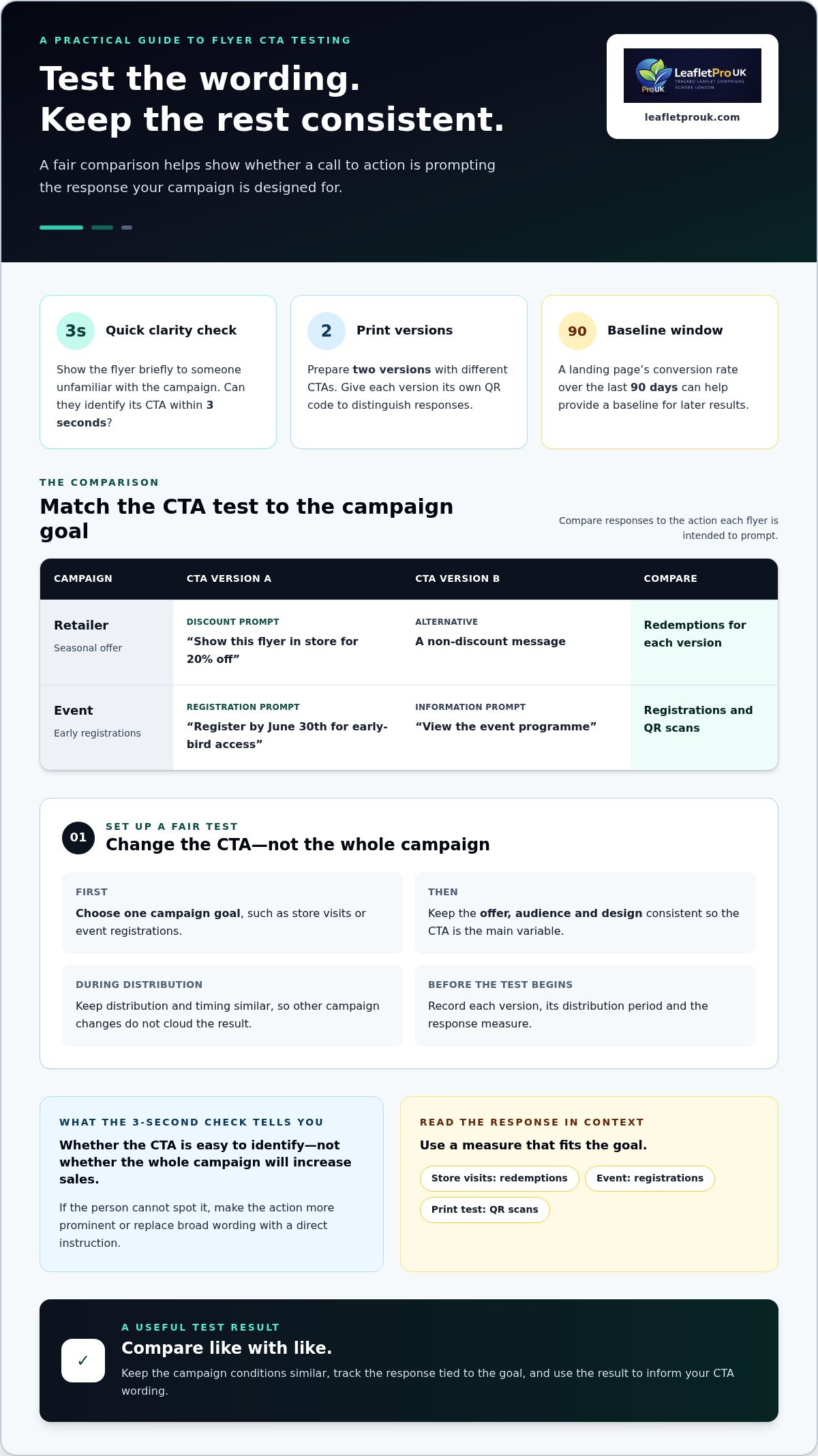
Testing helps show whether a message attracts attention and leads readers to the intended next step. Start with a single campaign goal, such as store visits or event registrations, then compare the wording against that goal. Keep the offer, audience and design consistent, so the CTA is the main variable.
Before printing, show the flyer briefly to someone unfamiliar with the campaign. Ask them to identify its call to action within 3 seconds. If they can’t, make the action more prominent or replace broad wording with a direct instruction. This quick test checks comprehension, not whether the whole campaign will increase sales.
For a print test, prepare two versions with different CTAs. Give each version its own QR code, then count scans to compare responses. Keep distribution and timing similar, so other campaign changes don’t cloud the result. A landing page’s conversion rate over the last 90 days can also provide a baseline for judging later results.
- Situation: A retailer wants to promote a seasonal offer. Action: Compare “Show this flyer in store for 20% off” with a non-discount message. Result: Track redemptions for each version to see which prompt brings more responses.
- Situation: An event organiser needs early registrations. Action: Test “Register by June 30th for early-bird access” against “View the event programme”. Result: Compare registrations and QR scans for each CTA.
- Situation: A service business wants enquiries. Action: Try “Request a free quote within 24 hours” on one version, then measure enquiries. Result: The response count helps identify which message prompts the intended action.
CTA examples should suit each channel. A fitness studio flyer might say, “Book an introductory class”; a restaurant email could invite readers to “Reserve a table”. On social media, “View the new menu” makes the next step explicit. A website button could say, “Compare membership options”, while a pop-up might offer “Get the event checklist”. For a digital advert, “Explore the course dates” sets a clear expectation.
Make sure the destination matches the promise. If an email says “Download the venue guide”, its button and landing page should use the same offer name. Consistent wording helps readers recognise they’re in the right place instead of wondering whether the link matches the original message.
Record each version, its distribution period and the response measure before the test begins. For a local print campaign, separate QR codes can distinguish versions and locations. A postcode-targeted flyer campaign can help organise a test by area, while keeping the CTA comparison clear.
Using CTAs on flyers, posters and business cards
A clear CTA gives every printed format a practical purpose, whether that’s booking, visiting or getting in touch. A bakery flyer might say “Pre-order your celebration cake”, while its business card could say “Call to discuss a custom order”. Each phrase suits the reader’s likely next step.
For digital-style campaign materials, UK Government guidance recommends making the CTA clear, using few words and placing at least 1 CTA near the top. On a flyer, that could mean putting “Book your place” near the event details, rather than hiding it beneath a long introduction.
Benefit-led writing connects an action with a useful outcome. “Download the weekly meal planner” tells readers what they’ll receive; “Download now” doesn’t. Tailor the phrase to its audience, too: a family activity poster could invite parents to “Find a weekend activity”, while a business card for a local repair service might say “Arrange a home visit”.
Choose placement to suit the format. A poster viewed from a distance needs a prominent, readable action, such as “See today’s menu” beside a short web address. A flyer can include more detail, with the CTA near the offer. A business card has limited space, so one instruction, such as “Call to arrange a viewing”, keeps the message focused.
QR codes, URLs and phone numbers offer different ways to respond, but none guarantees a particular response rate. A QR code suits a mobile action such as viewing a booking page; a short, legible URL gives readers a typed alternative. A phone number works for people who prefer to call. Match the response route to the action and make it easy to spot.
In UK advertising, claims, discounts and deadlines should be accurate, with important conditions stated beside the offer. For example, say who can use a discount and give the actual closing date, rather than implying a deadline that doesn’t apply. A specific, transparent offer gives readers a clearer basis for deciding.
- Situation: A restaurant wants more lunch bookings. Action: Put “Reserve a lunch table” beside its contact details. Result: The reader sees both the action and how to take it.
- Situation: A community event needs registrations. Action: Add “Scan to register” beside a QR code. Result: The route and next step are immediately apparent.
- Situation: A shop promotes a time-limited offer. Action: State the real end date and relevant conditions. Result: Readers can understand the offer before responding.
One primary CTA helps prevent competing instructions from dividing attention. If bookings are the flyer’s main goal, make “Book your appointment” the most prominent phrase. Keep secondary details, such as following a social media account, visually quieter.
What is a call-to-action?
A call to action (CTA) directs someone towards a specific next step, such as signing up or requesting information. To improve it, test the wording and visual presentation, then measure whether readers complete that action.
Begin with a baseline: record the current number of responses and the number of flyers distributed. For digital destinations, track QR-code scans and completed actions separately. Scans show interest; completed bookings or sign-ups show whether the destination delivered on the flyer’s promise.
Change one element at a time. If you revise the wording, keep the offer, layout and distribution method consistent. Compare “Sign up for class updates” with “Get class dates by email”. Both invite people to sign up, but the second spells out the immediate benefit and gives readers a reason to respond.
Placement is another element to test. Put the CTA beside the offer on one design and closer to the contact details on another. Ask readers to glance briefly at each, then say what action they noticed. If they overlook it, adjust its position or contrast before changing other design features.
Colour tests need the same control. Compare two contrasting button colours while keeping the words, size and position unchanged. A bright colour may attract attention, but it should remain legible and suit the rest of the design. Button-based CTAs have been associated with around 30% higher click-through rates than generic text-based CTAs, though outcomes depend on other variables.
For print, create two versions with different QR codes that lead to the same destination. Record scans and completed actions for each version, alongside distribution details. This helps distinguish curiosity from meaningful response and makes the comparison more useful.
- Situation: A yoga studio wants more class sign-ups. Action: Compare “Sign up” with “Find a class that suits your week”. Result: Sign-up counts reveal which wording moves more readers to register.
- Situation: A local theatre wants ticket enquiries. Action: Compare a CTA near the show details with one beside the contact information. Result: Tracked enquiries show which placement supports the intended action.
- Situation: A charity needs volunteer registrations. Action: Test a high-contrast button against a quieter treatment, keeping its wording fixed. Result: QR scans and completed forms indicate which visual treatment works better.
To measure and improve a flyer CTA’s response rate, track a defined action, such as scans, calls or registrations, against the campaign’s distribution. Compare the results for each version, keep the stronger wording or placement, then test one other change.
Use results to refine the CTA, not to assume one version will work equally well for every audience. A clear visual hierarchy, relevant benefit and direct action give each test a consistent starting point.
What a flyer call to action is and why it matters
A call to action is a statement or instruction that tells an audience what to do. On a flyer, “Book a table” or “Visit our Saturday market” turns an offer into a practical next step. Without that direction, readers may notice the promotion but remain unsure how to respond.
A flyer has approximately 3 to 5 seconds to capture attention. That makes the CTA part of the message’s working structure, not simply a decorative phrase at the bottom. It connects the reader’s interest to a response, such as calling, visiting, booking or scanning a QR code. Creating a compelling call to action for flyers starts with deciding which response matters most to the campaign.
The action should match the campaign’s purpose. If a community group wants event registrations, “Register for the spring fair” is more useful than “Discover more”. If a shop wants visits, “Visit us for the new season’s range” makes the goal clear. Each example names a response readers can recognise.
One primary action keeps a flyer focused. Ask what readers should do after seeing the offer, then state it in plain language. A flyer promoting a gardening workshop might say “Reserve your workshop place”. Adding unrelated prompts to follow social accounts, subscribe and call can make the main action harder to spot.
Placement supports the wording. A CTA at the bottom can work as a natural conclusion after readers see the offer and its details. If the flyer includes a response route, put it beside the instruction: “Scan to see the programme” should sit near its QR code. Match the language to the destination so the next step feels seamless.
- Situation: A library wants families to attend a story session. Action: Use “Book a family story session” beside the event details. Result: Readers see the activity and the intended response together.
- Situation: A charity needs local volunteers. Action: Write “Register your interest in volunteering” beside contact information. Result: The flyer gives interested readers a clear route forward.
- Situation: A market organiser wants stall enquiries. Action: Use “Ask about a market stall” rather than “Get involved”. Result: Prospective stallholders know exactly which enquiry to make.
For an effective CTA, check that the verb names an action, the benefit fits the offer and the response route works. Creating a compelling call to action for flyers also means viewing the design as a recipient: can you tell what to do, where to do it and what happens next? This simple review connects clear writing with a usable campaign.
LeafletPro UK: GPS Tracked Leaflet Distribution
LeafletPro UK helps businesses connect a clear flyer message with organised local delivery through GPS Tracked Leaflet Distribution and Postcode-Targeted Flyer Distribution. These services suit campaigns targeting selected areas across London, and GPS tracking is included to provide visibility over the delivery process.
If your flyer needs preparing as well as distributing, Leaflet Design Support and High-Quality Printing bring those steps together as an optional all-in-one service. This can help keep the CTA, design and printed material aligned, giving readers a clear route from receiving the flyer to taking action.
For a London campaign with a defined audience and a specific response goal, explore the distribution and print options available.
Put your next flyer campaign into action
Turn your chosen message into a flyer that gives people a clear way to respond. As you refine the wording, keep the campaign goal and reader’s experience in view. Creating a compelling call to action for flyers isn’t about adding pressure; it’s about making the action relevant, understandable and easy to take.
LeafletPro UK supports London campaigns with GPS Tracked Leaflet Distribution, Postcode-Targeted Flyer Distribution and optional Leaflet Design Support and High-Quality Printing. GPS tracking is included in every campaign, helping connect the printed message with a delivery plan targeted to the areas you want to reach across London.
A considered CTA gives your campaign a clear starting point. Build on that clarity, and take the next step with confidence.
Frequently Asked Questions
Are your flyers falling flat despite the design?
A polished design can still miss its mark if the offer doesn’t suit the intended audience or the response route is difficult to use. Ask someone unfamiliar with the campaign what they think it offers and what they’d do next. If their answers differ from your aim, review the audience, offer and destination together. For a local London promotion, make sure the flyer speaks to the needs of the specific neighbourhood it targets.
How can I make my CTAs more compelling?
Make the value of responding specific to the reader. For example, a gardening centre could replace “Explore our offers” with “Choose plants for a shaded garden”. The revised wording gives a particular audience a reason to engage. Check that the action matches the next page or contact route, too. If the CTA promises a planting guide, make it easy to find on the destination page rather than sending readers somewhere unrelated.
How do you write a great CTA?
Start with the result you want, then write a direct instruction that reflects it. A theatre aiming to sell tickets might use “Choose seats for Friday’s performance”, while a community group seeking helpers could say “Join the clean-up team”. Read each version aloud and remove words that don’t clarify the action or its value. Finally, make sure the offer and destination match, so readers know what to expect after responding.
What are some common mistakes to avoid when crafting CTAs?
Avoid vague prompts such as “Click here”, several equally prominent actions and claims the offer can’t support. For example, “Book a free assessment” creates confusion if the next page describes a paid service. Don’t crowd the instruction with unrelated details. Put practical terms near the offer and give the main action visual priority, so readers can distinguish it from supporting information.
What does a CTA do?
A CTA turns a reader’s interest into a defined response, such as making an enquiry, attending an event or requesting a menu. It also helps a business see whether its campaign prompts the intended behaviour. For instance, a gardening workshop can count bookings made through the flyer’s dedicated response route. This is more useful than knowing only that the flyer attracted attention, because it connects interest with a measurable action.
How do you write a clear and compelling flyer CTA?
Name one action, make its relevance clear and remove uncertainty about how to respond. A children’s bookshop promoting a reading session could write, “Reserve a place for your child”, then give the booking method beside it. Keep the wording consistent with the booking page or contact details. Before printing, ask a reader to explain the instruction and say what they’d do next.
What are examples of effective calls to action for different flyer types?
Match each CTA to its offer: a retail flyer might say “See the new homeware range”; an event flyer, “Reserve your place at the craft fair”; and a fitness flyer, “View class times”. A restaurant could use “Ask about today’s vegetarian options”, while a service flyer might invite readers to “Describe your repair and request an assessment”. Each example tells its audience what to do and where their interest leads.
Where should a call to action appear on a flyer?
Place the CTA where it follows naturally from the offer, with enough visual separation to stand out. If the flyer introduces a class, then explains its location and booking details, put “View available sessions” beside the booking information. A short promotional flyer may need the action higher up. Check the reading flow at print size, and keep contact details close to any instruction that relies on them.